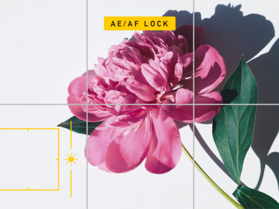
When it comes to composing images, iPhone photographers are on par with photographers using the most expensive cameras and equipment. That’s because photography composition isn’t about technical skill. It’s about taking advantage of light, lines, shapes, and objects in a scene and composing them all to create the most compelling image.
Photography composition requires practice, experimentation, and creativity. Fortunately, a stunning composition can be created by anyone with a passion for photography — no matter what camera you use.
Understanding photography composition
If you’re new to photography, you may find that following a set of composition rules is both helpful and educational. Just remember that composition rules aren’t set in stone. They’re just guidelines to keep in mind on your road to developing your unique style as a photographer.
What is the composition of a picture?
The term “composition” simply refers to the way elements are arranged in a scene to make the most compelling and interesting shot. This is the result of the unique relationship between the photographer and the subject being photographed. It is also part of what makes up your unique photographic style.
The key elements of photo composition
Your approach to composition in photography won’t be the same as that of other photographers. But that said, all photographers can take advantage of one or more of the following key elements:
- Lines: Lines have the power to draw the viewer’s eye toward compelling objects within your photo. Lines can be horizontal, vertical, diagonal, curved, or straight.
- Shapes: Shapes can be obvious or abstract. They have the power to change the emotional impact of your photo and attract attention.
- Patterns: Patterns are simply repeating elements within the scene. They can add impact to any photo.
- Texture: Textures help give your photo dimension and can be found within small details or large parts of your scene.
- Color: The color palette of your image can change the mood of your photo entirely by evoking certain emotions, adding drama, or creating tension.
- Tone: Tone represents the relationship between the darks and lights of your photo. High-contrast photos include bright whites against dark shadows. However, you can also create photos with various shades of dark or light tones to add drama.
- Balance: Symmetry and asymmetry alike can be used to create balance within your image. Every part of a photo has visual weight. It’s your job to position objects so that your photo feels balanced. Of course, you can also create intentionally unbalanced compositions for more impactful storytelling.
- Depth: Depth is the perceived distance between the closest object in your photo and the elements that are farthest away. There are lots of ways to create depth in a photo by using lines and shapes.
- Space (positive and negative): Positive space is the area of your photo where objects attract the viewer’s attention. Negative space, on the other hand, is the “filler” between regions of positive space.

What makes a good photo composition?
The term “beauty is in the eye of the beholder” applies to photography as well as other forms of art. Effective composition strategies can lead your viewer’s eye toward the most compelling elements of your photo. What they see and how they feel, however, is a unique experience all their own.
The top 10 photography composition rules you should be following
The general rules of composition can be used creatively to add interest, evoke emotion, and tell a story. As you learn to use these compositional elements, you will start to appreciate what makes a compelling composition.
1. Rule of thirds

The most well-known rule in photography is the rule of thirds. To use the rule of thirds, you simply divide your scene into nine equal rectangles and position the most prominent objects in the places where those lines intersect.
Once you learn how to use the rule of thirds in photography, you will start to compose certain photos within this framework automatically. If you are just starting out using the rule of thirds, you can turn on the grid overlay on your iPhone camera by going to Settings > Camera > Grid. Now, you don’t have to visualize the rule of thirds. You can use the grid right on your screen.
2. Golden ratio
The golden ratio in photography composition is based on spirals found in nature, such as the curves found in a snail shell. Objects in a photograph are placed along a curve that flows through the frame and leads your eye around the picture. If you have the rule-of-thirds grid enabled on your iPhone, you can use it to position your main subject and then imagine the other compositional elements along a spiral. (For some examples, search #goldenratio on Instagram.)
3. Leading lines

Leading lines are used in photography to draw the viewer’s eye toward a specific point of interest. They can be straight or curved and are usually positioned to add dimension to your photo and draw the viewer in. Leading lines can be real concrete lines that are formed by a road, path, or architectural element. Or they can be implied leading lines created by trees, streetlights, or other objects receding into your photograph.
4. Framing
Framing a photo means incorporating an element within the scene that will act as a frame for the main subject. This frame can be man-made, like windows or doorways, or it can be natural, such as foliage or tree branches. Using a frame within a frame will add depth to your image and emphasize the focus of your shot.
5. The golden triangle

The golden triangle rule is a variant of the rule of thirds. To create a golden triangle, start with an imaginary line that runs from one corner of your frame to the other. Now, from the bottom of the other two corners, draw straight intersecting lines to your first line to form 90-degree angles. The result is a design composed of three lines, four triangles, and two points of intersection. Place your main subjects on the intersection points, and position any leading lines along the imaginary lines you’ve created.
6. Perspective
Perspective in photography simply refers to the angle you are shooting from. Most beginner photographers frame their shots while standing with the camera at eye level, but sometimes, getting down low or up high will make for a more interesting composition. When framing your shot, crouch down in a kneeling position or hold your phone high over your head. These unique compositions will likely end up being your favorites.
7. Fill the frame
Filling the frame involves getting in close and making your subject the only significant element within your shot. In this case, the frame refers to the edges of what you will be able to see in the photograph. You can fill the frame simply by zooming in on your subject so that it fills the screen of your iPhone. Or you can try filling the frame with your subject by cropping your shot later. Filling the frame is a good option when you want to capture your subject in detail or when the background is taking away from your subject instead of adding to it.
8. The rule of odds
The rule of odds works on the premise that an odd number of subjects is more visually appealing than an even number. Odd numbers are thought to be more interesting and to hold a viewer’s attention longer. If given the chance, try using the rule of odds to create a more compelling image. You can also use cropping to focus only on an odd number of elements within your shot.
9. Foreground, middle-ground, background

It often makes sense to include elements in the foreground, middle-ground, and background of your photo. Instead of a shot of the sun setting over a seemingly endless sea, position your photo to feature sand and seaweed in the foreground and perhaps a small ship on the rolling waves. Suddenly, your sunset image is telling a story and drawing the viewer in. And because photographs are two-dimensional, including an element in the foreground will automatically give your image a three-dimensional aesthetic.
10. Rule of space
If you are photographing something that is moving or oriented in a certain direction, the rule of space suggests that you leave negative space in front of your subject in that direction. Basically, our eyes tend to follow the movement of the subject of a photo, so the rule of space draws the viewer into the image instead of away from it.
For example, if you are photographing an animal walking, you should leave a significant amount of negative space to show where the animal will move to next. You could also use the rule of space to highlight where someone is gazing or where an object is pointing.
These photography composition rules are simply guidelines to encourage you to think more critically and creatively before you tap the shutter button on your iPhone. While there are many amazing examples of stunning photographs that break these rules, we find them to be great jumping-off points for compelling compositions.


